Saturday, February 11, 2023

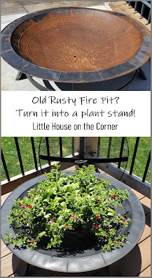
Simple DIY: Rusty Fire Pit Turned Plant Stand

I've got a simple DIY project to share with you today (okay, so I actually completed this project almost a year ago, but hey, better late than never). 

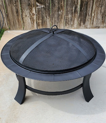
This fire pit was given to us as a gift many years ago, and while we did use it a few times at first, it eventually became too much of a hassle to deal with (side note: we've recently gotten this fire table with propane tank, which is much easier to use and enjoy). 

Anyway, we didn't ever throw the old fire pit out, but just stashed it away outside with some other stuff. As you might guess, it started to rust... badly. However, I didn't want to send it to the landfill and felt there was surely a way to repurpose it. After some brainstorming I finally decided to turn it into a plant stand to put on our newly rebuilt deck. 


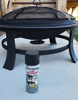
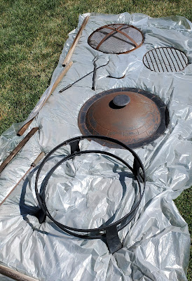
The first task was to clean it off as much as possible with a wire brush, then just wipe all the pieces down thoroughly. After going out to purchase some Rust-Oleum Rust Reformer, it was time to start the transformation. 

I laid all the pieces out in the yard on a large piece of painter's plastic, then started spraying my little heart out. I can't remember if it took two or three (or four?) coats, but it did require a bit of patience until a uniform finish was achieved. Also, as with any spray paint project, it's ideal to do this on a day with little to no wind -- which, fun fact, is virtually impossible here in Kansas. 

After the Rust Reformer was applied, I finished it off with a couple coats of Rust-Oleum Matte Clear Enamel. And voila! The fire pit was looking pretty sharp now compared to the old rusty version. 


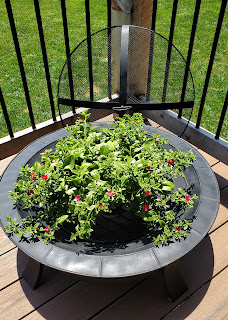
My original idea was to use the fire pit as an actual planter and fill it with dirt and some flowers (or possibly succulents). But I never got ambitious enough, so currently it's just used as a plant stand for a potted plant. The bright green of this ice plant really popped against the new black finish!


So there you have it. Nothing fancy, just a good ol' spray paint transformation. Have you ever used the Rust-Oleum Rust Reformer to bring something back to life?


Saturday, November 5, 2022

Finishing the Basement Bathroom: Part II (The Reveal)

After more than 14 years of living in this house, I was truly beginning to think we would never have a bathroom in our basement. We had long since gotten used to going upstairs every time we needed to use the bathroom (extra exercise!). But a few months ago, we finally settled on a contractor to do the job for us and got on their schedule in October. It took them a couple weeks, which was really nothing if you consider how long it would have taken us to DIY it. 

As a reminder, here's what stage it was at when we turned things over to the contractor. For more before pictures (and a brief history of how we had to reconfigure this bathroom layout early on to make the space more efficient), check out my previous post


But let's be honest, you're just here for the "After" photos (don't blame ya), so keep scrolling to feast your eyes on our shiny new bathroom! At the end of this post, I've included a list of the various materials/fixtures we used. 

It's always a bit challenging to envision how an unfinished space will look once everything you've selected is all put together, but honestly I'm super pleased with how this turned out. It may be the smallest bathroom in our house, but ironically it's the nicest.


We still plan to add a couple floating shelves (either glass or wood) above the toilet. I just don't want anything that feels too heavy or obtrusive in this small space.


The finished shower space is about 36" x 42". The niche provides storage space, and I also wanted to include a foot rest to make leg shaving easier.


The oak butcher block was part of a slab that we already had on hand from our kitchen renovation. We left the color natural and simply applied several clear poly coats for a nice, smooth, water-resistant finish.


Because the bathroom is so small and there's not much counter space, we utilized the space between wall studs for a built-in niche that coordinates with the one in the shower.


The mirror we chose is simple and frameless, so as not to detract from the picket tile wall and pendant light  which are the main focal points.


We chose to add a towel bar on the vanity drawer because we didn't want a towel hanging on the wall next to the sink. It just seems like a cleaner look this way (plus the bar doubles as the drawer pull).


So if anyone needs me now and can't find me upstairs, I'll just be down here in our bathroom gawking in disbelief and delight.


MATERIALS/FIXTURES/COLORS

Wall mount faucet
Pfister Kenzo Wall Mount Bathroom Faucet (Brushed Nickel)
Shower faucet
Pfister Kenzo Tub & Shower Trim Kit (Brushed Nickel)


Sunday, October 30, 2022

Finishing the Basement Bathroom: Part I

 She's baaa-aaack!

Well folks, it's been one year and ten months since my last blog post (cedar chest chalk paint makeover). That might be a new record lapse for me. Rest assured though, I haven't fallen off the face of the earth. I know everyone was worried.

Let me just get right to the big news around here lately. After more than 14 years in our little house on the corner, we finally got the bathroom in our basement finished! Let me clarify... we finally decided to hire someone to come do it for us. After the countless DIY renovations we've already done, this was a project we were willing to just fork over some (okay, a lot of) money and hire it out. After all, they'd have the bathroom done in two weeks when it would probably take us 6+ months. Also, the idea of us trying to do a fully tiled shower and backsplash wall with no tile experience? Hard pass.

BUT, before I get to the reveal (which I'm going to save until my next blog post, #sorrynotsorry)... here are some photos of what the bathroom looked like in the "before" stages. We did all the framing ourselves way back when we framed the rest of the basement. Luke also did most of the drywall, along with the electrical wiring and plumbing hook-ups. 


Oh, and if you want to take a walk down memory lane with me, check out this post from 2011 about how we had to tear out the concrete floor to re-work the location of all the plumbing and drain pipes... That was such a traumatizing fun experience, I had almost forgotten all about it.


It's a very small bathroom, but the layout we designed accommodates a 36x42" shower, a 30" wide vanity cabinet, and of course a toilet. We also planned for a large niche in the shower and one in the wall next to the sink to help maximize functional space.


All the materials have gradually been purchased over the past year or two, with the exception of the vessel sink which we bought about 10 years ago (yes, seriously... back when we had the ambitious idea of finishing the bathroom ourselves). This bathroom was really our first experience with picking out all the materials for an unfinished space, rather than just figuring it out as we go, which has been the case with some of our other DIY renovations. That was a little overwhelming, just because decision-making in general is tough for me, along with trying to envision what it would all look like together.

The price of the sink was pretty reasonable, but some of the other fixtures (such as the Pfister Kenzo line of faucets and coordinating towel bars) were a bit of a splurge, considering our typical penny-pinching shopping behavior. 


Wall mount faucet
Pfister Kenzo Wall Mount Bathroom Faucet, Brushed Nickel


Shower faucet
Pfister Kenzo Tub & Shower Trim Kit, Brushed Nickel


Shower floor tile


Mosaic picket tile (for niches and vanity sink wall)


Pendant light fixture


Towel bars, etc.


Stay tuned for my next post to see how it all came together! I promise I won't make you wait another two years. 


Saturday, January 23, 2021

Cedar Chest Chalk Paint Makeover

Before yet another month slips away from me, I wanted to share this quick post about a recent DIY project. Over the New Year's weekend, I decided to give a makeover to an old cedar chest I'd acquired several years ago. While the inside of it is obviously cedar, it had laminate (I think) on the outside which was looking pretty rough. And the overall color isn't exactly our style. Oh, and one of our dogs had chewed on a corner of it a long time ago. Yikes. 


But all aesthetics aside, this was a nice solid cedar chest which I didn't want to get rid of. Enter my favorite makeover magic — chalk paint! I figured I had nothing to lose by painting it, just like I've done with so many other pieces of furniture and cabinetry in this house. Not wanting to spend much (read: any) money on this project, I rummaged through my existing stash of chalk paint and decided on Annie Sloan Graphite (the same color used on our lower kitchen cabinets). 

All I did to prep the chest before painting was give it a quick wipe-down to remove any dust. Yep, that's all. One of the many reasons to love chalk paint. I guess I did also have to tape off the back side and the underside of the lid, which took some extra time. 

Then, I thinned the paint with a little bit of water (helps with smoother coverage) and started brushing it on. I decided to do random brush strokes everywhere rather than trying to paint in straight lines, thinking it might add a little "crosshatch" texture to the piece once done. You can't really mess this stuff up either way. (Another reason to love chalk paint!)

It ended up taking three coats of the Graphite paint to attain sufficient coverage, which is about what I had expected. Once the final coat was dry, I applied the clear wax to it. Then a day later, I buffed it with a clean, dry cloth to give it a buttery soft sheen. 

And, voila! Weekend project finished. We moved the chest from our office upstairs into our basement, and it's used for storing board games and other miscellaneous items. I have to say it looks sooo much better in this graphite color! And bonus, chewed-up corner is hardly noticeable now. Another chalk paint win in the books, folks.


And lastly, a couple "before & afters" for the full effect!


Thursday, December 3, 2020

Master Bathroom Makeover Part II: The Reveal

I thought this day might never come, but I'm finally ready to share the official "reveal" of our DIY master bathroom makeover. It's been months in the making — a weekend here, a weekend there, you know how it goes. The polished chrome towel bars still haven't been switched out yet, but who knows if I'll ever get to that.

So, is this my dream bathroom now? Well... no. But, it's a vast improvement and much-needed freshening up. All in all, we achieved a big transformation with a fairly small budget (I think we stayed under $1,500).


Keep on scrolling for all the photos and more details!

Before: Dark & Drab


After: Lighter & Fresher!


To be honest, it all looks much better in person. There's no natural light and our bulbs are on the warm side, so it's challenging to get great photos. And, my camera phone was struggling to focus and capture the detail on the distressed cabinets. (Excuses, excuses...) Anyway, here's a brief rundown of the updates which have taken place over the past few months:


Painting the walls Colonnade Gray by Sherwin Williams


Tearing out the old grouted tile countertop and backsplash
(and destroying some drywall in the process)

Patching the drywall, spraying the texture and repainting

Installing a new solid white countertop with integral sinks

Installing new faucets


Though it was a fairly tedious project, painting the vanity instead of getting a brand new one saved us a good chunk of money. Another cost-saving decision was keeping our existing mirrors, light fixtures and cabinet hardware, since they mostly still coordinated with the new updates. Also, we obviously didn't replace the flooring either — that was just way more than we wanted to get into at this point.


Neither one of us was too familiar with the Kraus brand before this, but it turns out these faucets are really beautiful and high-quality. The brushed gold is almost more of a champagne color.


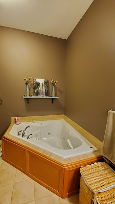
This shelf has been here for years, but now the vases and canvas print stand out much more against the light gray walls. 

I'd love to hear what you think about the new paint colors and other updates! If it were your bathroom, how would you have transformed it on a budget?


LinkWithin

Related Posts with Thumbnails