Sunday, February 28, 2010

Do two people really need this much food?

I always thought our pantry was a pretty decent size -- a definite upgrade from the non-existent pantry we had when we lived in our apartment. Well, as it turns out, the more space you have, the more you buy to fill it up!

Awhile back, I bought some little wire racks at World Market in an attempt to better utilize the height of the shelves, and that helped for awhile. But every time we stock up on sale items -- like I did on my most recent grocery shopping trip -- it gets a little more out of control in here. It doesn't help that we also have to dedicate one of the shelves to small appliances, since we don't have enough cabinet space in the kitchen.


If you were ever curious as to what we eat, now you know.

Things are just stacked and piled on top of each other wherever they fit, and it takes some digging to find what we want. Plus, stuff gets buried and we forget about it until we discover it much later. It's very depressing when you're really craving some popcorn, only to find out the box you have is a year past its expiration date. I ain't messin' with that.

So I finally got sick of staring at these cluttered shelves every time I opened the pantry door, and took a visit to Home Depot to see what storage solutions I could find. Luckily, they just happened to have two of these 3-tiered wire racks left, at about $11 each, a price I could definitely stomach.

I snatched them both up, of course. They may not be the most glamorous, but this project was all about function, not style. The racks came with anchors, screws, and plastic clips for mounting, but those anchors weren't going to work for our hollow pantry door. So we took a trip to Lowe's, where we had previously seen anchors made specifically for hollow-core doors. Genius! 

The anchors worked pretty well, except some of them tore up the door a little bit. Oh well, it was covered up with the mounting clip anyway.
 

After about 45 minutes, the racks were installed!


Of course I wasted no time sorting through our shelves and deciding how to best fill those gleaming white racks. I didn't want anything too heavy on them, so this is what I ended up with:

And here are our newly organized pantry shelves:

Maybe you can't tell much of a difference, but I know I can!

For under $25, we were able to add much more functional space to our pantry. Now that we can find things easier, maybe we'll also waste less money on expired food that we end up tossing.

Do you have any pantry problems? 

Monday, February 22, 2010

The difficult way to make a mirror

Remember my last post when I teased you about out latest project?  Well, by now I've obviously given away what it is. 

I've been dying to get something on our blank dining room wall, but it's been taking a backseat to other priorities for the past two years. Even when I did shop around, trying to find some inexpensive artwork, mirror, or wall decor was proving difficult. Plus, I just didn't know how the heck to fill that big space. Let's remind ourselves what I was dealing with:

Well, that was before I started blogging and getting all these great ideas from you creative peeps! Enter the Pottery Barn Mirror Knock-off over at Starter Home to Dream Home. Love at first sight. It's a substantial piece, but I like how the mirror is visually broken up with the framework for added interest. So immediately I put it on my list of DIY projects to copy someday. And eventually, I mentioned it to Luke enough times that he agreed to help me make it so I'd shut up about it. :)

Our version, however, differs quite a bit from Mikael's version, but the end result is similar. The main reason is because we wanted to make it weigh less instead of mounting the mirrors to a big piece of heavy particle board. But it still needed to be sturdy. I kind of left the logistics of this design to Luke, with some sprinkles of input here and there. Basically, the idea was to cut a groove into our framework so the mirror tiles could slide into said grooves. Then simply piece the framework together with some wood glue and angle brackets. But would it all turn out as we envisioned it?

First, here's the materials list (all from Lowe's):
Poplar board
12" x 12" mirror tiles with plain edge (9)
Minwax Stain - Ebony 2718
2 1/2" zinc plated corner brackets (4)
Eye hooks (2)
E-Z wall anchors (2)
2 1/2" screws (2)

I wish I could tell you how the exact measurements for all of the framework and cut-outs were determined, but I think these drawings by Luke sum it up best:


Clear as mud? That's what I thought. Again, I put my trust in Luke to figure the mathematics - that's not my forte.

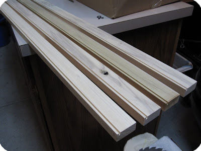
We borrowed his dad's table saw to make all the cuts, including the channels in the inside edge of what would be the four outer pieces of the frame (which were eventually mitered for a cleaner finished look).


Then, we cut a groove in both sides of the four inner framework pieces (and when I say "we," I mean Luke). The architect in him also decided it would look cooler to make the four inner corners of the framework overlap so the mirror would technically have no top or bottom (or something to that effect... I took his word for it). This made things a little tricky, but essentially we (Luke) ended up cutting out sections of the four inner pieces so that they would lock together into a square.


When we had completed all the cuts, we laid everything out on our handy worktable ping-pong table in the basement to dry fit the pieces together. This is when we hit our first little hiccup. How in the world were we going to get the center mirror in those grooves? The way the pieces locked into each other and overlapped wouldn't allow for us to slip it in.

Oops.

Solution: Cut two of the pieces so that we could pull the center square apart to insert the mirror. Because of the location of the cuts, they would only be visible from the backside anyway. Crisis averted!

So here's the mirror after the practice assembly:
I was very excited to see it all coming together!

Next step? Staining. That part I could handle. Conveniently enough, I already had some Minwax Ebony stain from a previous project. I sanded down the boards, and after three coats of stain, finally achieved the desired darkness (or close enough anyway; I was getting impatient). A coat of poly, and we were good to go. The rest would be cake, right?


Not quite. When we slipped a mirror tile into one of the grooves, we realized the edge of the mirror reflected the light part inside the groove that I hadn't seen the need to stain. Oops again. A black Sharpie could have solved this problem, if only we could get it to fit inside that narrow groove. Then my resourceful hubby had an epiphany:

A syringe!
It was a little tedious, but it did the job without making a huge mess around the parts I had already stained. Crisis #2 averted.

So after a few more hours of drying, it was finally time for assembly. This time we put it together face-down, since we had to add the angle brackets on the backside. We started in one corner, making sure it was square and securing it with a bracket, then worked our way out.


By the way, here are those four inner corners I was telling you about earlier, if you can see how they fit together:


 It took a little (ok, maybe a lot of) tweaking here and there to get everything to fit, but eventually this is what it looked like on the backside:


We added an angle bracket to the four outer corners of the frame and that seemed to be enough to keep it all held together tightly. We might go back in eventually and add more brackets or other cross-bracing if we think it needs extra stability, but it should be fine just hanging on the wall. Well, as long as no one bumps the frame, nothing hits those mirrors, and we don't have an earthquake here (not likely in KS).

Two eye bolts and two wall anchors later, and this is the end result: 


This project had its frustrating moments (as usual), but I'm pretty happy with how it turned out! It's roughly a 38" square.  So what do you think? Do we still need something else to jazz up that big wall?

Let's recap:
32 feet of 1x2 poplar board - $25.60
Mirror tiles - $17.96 (still have three left)
Corner brackets - $2.97
E-Z wall anchors - (already had on hand)
2 1/2" screws - $1.25
Eye hooks - $1.18
Total cost - Under $50

So there you have it. Another DIY project, another lengthy post. Hope it was worth the wait for the reveal! :) Thanks again to Mikael (and Pottery Barn, of course) for the inspiration!

UPDATE: Some of you have suggested to put a console table underneath the mirror. I think this is a terrific idea; however, our dining room is pretty small and I'm afraid it would make for a tight squeeze when the chair at the table is pulled out (especially if we pull the table out to its 8-person size). But I am going to keep exploring my options!


Friday, February 19, 2010

Project Sneak Peek

Two posts in one day?! Normally I'm lucky if I get two in one week!  Ok, so today's posts have been more like blurbs instead of my usual long-winded ramblings. That explains it.

For now, I just wanted to give you a little preview of a DIY project (one of a couple) that we're working on. Because I'm a tease like that. I've been wanting to do this for quite awhile, ever since I saw the inspiration on another blog. (Yes, I'm being very cryptic right now.) 

Any takers?
(I might be a little upset if anyone actually guesses it.)

So if all goes well, it will be completed by the end of the weekend. However, I've learned that these kinds of projects generally take about, oh, 7 times longer than you think they will. So I've probably just jinxed myself by doing this, but oh well. I'm still holding out hope that I'll be able to reveal the finished product soon... knock on wood.

 What are YOU working on this weekend?

UPDATE 2/21: Almost done! It's looking like I'll be able to reveal this project tomorrow (Monday) night!

Featured on Better After!

I'm super-excited because I just found out that our little "hole in the wall" project was featured on the awesome Better After! (Thanks, Lindsay!) If you haven't checked out this blog before, you should - you'll see some amazing and inspiring transformations!


Wednesday, February 17, 2010

Real-life House Tour!

Welcome to our little home! I'm linking up this (partial) house tour to the Real-Life House Tour Party over at Transforming Home. (Great idea, Danielle!) I'm only featuring the "core" of our house for now - the most presentable rooms at the moment. Plus, I have some projects currently in the works for some of the other rooms and don't want to show them quite yet. But you'll still see some parts of our house that I haven't shown yet, so I hope you enjoy!

(I apologize if some of the pictures are a little blurry... apparently I still have not learned how to use my new camera.)

Front door, which I plan on painting soon! Come on in...

This is what you see when you walk into our strange entryway. We've had those temporary paper shades in our living room windows for about, oh, two years now. I like the arches, which give the house some character. The ceilings throughout are also 10 feet high, which makes the small rooms feel much more spacious than they are.


To the right of the door is the rest of our "foyer" (for lack of a better word). The sideboard was a wedding gift from Luke's parents - our first real piece of furniture!

Next to the living room is the archway leading into our dining room. Normally we have piles of paper on the table, but I cleaned up a bit for the tour.  :)  Note: We have an exciting project in the works for that big empty wall!

And this is the view of our dining room from the kitchen - notice the hole in the wall, which we added (errr...subtracted?) ourselves!

Here's the view from our dining room looking back toward the hallway and staircase (which leads down to our unfinished basement). To the left is our guest bedroom, and to the right is our hall bathroom and office. Note: My talented hubby made the ladder shelf - more on that some other time.

We have a nice little ledge in our staircase where we're currently displaying some photos and souvenirs that Luke brought home from when he studied abroad in Europe a few years ago. When I look at this picture though, it looks like we need some larger artwork to fill up that wall! This photo makes the walls look kind of orange-y, but they are more of a reddish-brown.

Lastly, our hall bathroom. I was pretty pleased with how the Target shower curtain coordinates so well with the wall color! This bathroom is small, but cozy. I prefer it over our master bathroom sometimes!

FYI - We haven't painted any of the walls yet since we moved in. These were the colors that the builders selected, which luckily we happened to like! (Although their paint job left a little to be desired - all the rooms could probably use another coat. )

That's all for now, folks... thanks for visiting, and stay tuned for some fun projects! :)
 

Saturday, February 13, 2010

Front Door Facelift

Well, it was bound to happen eventually. After my sister painted her front door bright yellow, and after seeing a lot of other colorful front doors out there in blogland, I've got the itch! I hadn't really considered painting our door up until recently; I guess I've been so focused on the inside of the house.

But the more I look at our non-descript door, the more I realize that it needs a makeover! A fresh coat of paint would do wonders to make our big, empty porch look a little more welcoming (well, that and getting some patio furniture or big planters would help too.)

So the question is, of course, what hue to choose?? My first instinct is red, even though some may say that's overdone. It would definitely inject more personality than this yawn-inducing beige does. And even though we have reddish brick, I think red would still be a nice pop against the white trim of the doorway.


My pondering led me to to the all-knowing Google, where I searched "front door colors." I found a lot of articles on front door feng shui. According to this one and this one, our north-facing front door should be either black (no), white (no), or blue (maybe??). And red is apparently recommended for south-facing doors. Ok, so maybe I'll break those feng shui rules...

I also found this article at HouseBeautiful.com, and I think these colors have some potential:
Benjamin Moore Moroccan Red 1309
 
Benjamin Moore Evening Sky 833
Pratt & Lambert Beeswax 11-6
 
The more I think about it, the more I might be digging this deep plum... but would it just look black on our shaded porch?
C2 Paint Wicked 6446

Then I found these inspiration pics on Google images. Don't these doors all look very welcoming?


We probably won't get around to any painting until the weather warms up (which will hopefully be SOON), but that gives me time to think about it. So here's where you come in... considering the rest of the exterior, what color do you think would look best on our front door? Maybe it's not even one I've mentioned. I know you've all got good taste, so lemme hear it!


.

LinkWithin

Related Posts with Thumbnails