Pages

Saturday, December 2, 2017

Front Door Makeover: Long Overdue, But Probably Not The Last One

I have some good news for you (and me). This is going to be one of my shorter blog posts as of late! For once I have a quick and easy project to share rather than a painfully long, drawn-out transformation.

I've been wanting to give our front door a makeover for quite some time, but just haven't gotten around to it with so many other things taking priority. In fact, in looking back through my blog history, it's been seven years since I last painted the front door. (Okay, so that's actually super depressing, but anyway...)

Above photo circa 2010... 
This was also before we installed a screen door.

Last weekend, pre-painting

With the extra couple days off this past Thanksgiving weekend, plus some unseasonably warm weather, the timing (and motivation) was finally right. After a long internal debate between a few paint swatches at Sherwin Williams, I decided on Copen Blue, which is part of their HGTV Home Rustic Refined collection. 

The prep work and taping was pretty minimal compared to other painting projects. 


I was able to do one coat in the afternoon, and then a second coat in the evening. I need more immediate gratification projects like this in my life. A bit of patience was still required since I had to wait until the next morning to see it in daylight.


This color is like a breath of fresh air for our porch, which was feeling awfully dark to me. The best way I can describe it is a pale minty/aqua color (even though it says "blue" in the name). Though I do love it, I'm still wondering if it's a touch too pale... maybe it should contrast a bit more with the white trim? Gah, this blue/green color family is almost trickier than grays! I like the more muted tone, and don't want it to get too bright or saturated. 


So Copen Blue is the color it shall remain, unless I decide to try a different shade later down the road. (I was also eyeing the SW colors Watery, Waterscape, and Tidewater... yeesh.)

What color is your front door? I'd also love to hear your thoughts on the color I chose, or any other recommendations!


NOTE: Little House on the Corner is a participant in the Amazon Services LLC Associates Program, an affiliate advertising program designed to provide a means for sites to earn advertising fees by advertising and linking to amazon.com.


Sunday, November 26, 2017

Coastal Bathroom Makeover - Full Reveal

Is there really any such thing as a true "before and after"? I'm beginning to think not. Rather, I think it's like "before and various-stages-of-in-between." At least in our case that's more accurate, since it seems we're never quite 100% finished with something before we either change direction mid-course or just move on to a new project entirely. (Can anyone else relate?)

Anyway. That rambling leads me to my current blog post, which is sharing the most recent version of our hall bathroom. We still have to re-attach some baseboards and caulk along the vanity sidesplash, but hey, it's almost finished...

First, take a good look at this blast from the past (when we first moved in):


Now, let me walk you through each stage of the gradual transformation since then (including links to the blog posts if you want more detail):

Tuesday, November 21, 2017

Coastal Bathroom Shelves and Styling

There was a major development in our house over the weekend, folks. The wall behind the toilet in our hall bathroom, which had been bare for months, finally got some new shelves. It may not seem that newsworthy, but trust me, it's a big deal. 


Let me rewind just a bit...

We used to have a metal etagere over the toilet, but when we installed our new flooring I ended up moving it into our master bathroom just to get some much-needed storage there. Plus, I wanted an excuse to get some new shelving in the hall bathroom which gets more visibility.

Saturday, September 23, 2017

Dining Table Chalk Paint Transformation: Part II

Did you catch my last blog post about painting our dining table? If not, go check that out now. I'll just wait right here. 
...........................................

K. Now that we're all caught up, it's time to share the full reveal of the table transformation, including our new chairs!


While I had been fairly confident about the look of the table (two-tone; distressed legs), the chair selection was a different story. We weren't trying to find something to match the table, but rather just "go" with it. I'm all about the mix-and-match approach these days. But it was bit overwhelming to sift through all the options and make a decision on style, material and color.

At first we were thinking of some metal chairs like these, or these, but Luke wanted something with a higher back and a more formal look. The next path we explored was looking at fabric chairs along these lines. I was almost sold on this style, but then decided I wanted something with more of an open back rather than a solid one. It just seemed like it would make our small dining space feel bigger somehow, but maybe I'm weird about things like that. 

Monday, September 4, 2017

Dining Table Chalk Paint Transformation: Part I

We've had our dining room table ever since we moved into our house, which has been about 9 years now. It's nothing too special really, but a solid piece of furniture nonetheless. The finish is black with a bit of subtle distressing, and it has a hidden butterfly leaf allowing it to expand to 54x54" (although we usually keep it to the smaller 36x54"). 


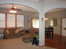
The table is also counter-height (36"), which worked out really well back when we had a wall separating our dining and living room as seen above. We had initially cut out this window opening in the wall in order to connect the two spaces a bit more (and let's be honest, in order to be able to watch TV while we ate). Anyway, the counter-height table allowed us to easily see through the window into the living room and have conversations with anyone else sitting in there.

Friday, July 21, 2017

Bathroom Vanity Chalk Paint Makeover: Part II

[NOTE: Missed out on Part I? Check it out!]

Between finishing our basement and the ongoing renovations on our main floor, I live for mini-victories like this one to keep me motivated (read: sane). It reminds me of the way I felt after my coffee table makeover and kitchen cabinet makeover. The common thread running through these projects? Chalk paint!

Yes, once again, I turned to my trusty can of Annie Sloan chalk paint to transform this vanity in our guest bathroom.


Before: Boring, blah, builder-grade.
Much like all of our other cabinetry and trim (which has since been painted), it featured an Oompa Loompa-esque stain.

Thursday, July 13, 2017

Bathroom Vanity Chalk Paint Makeover: Part I

I am hereby naming our main floor renovation "The Snowball Project." What began as replacing floors turned into removing walls turned into painting trim turned into re-doing the kitchen turned into replacing light fixtures (not necessarily in that order)... Well, you get the point. 

The reason this renovation snowballed to include our hall bathroom is that the bathroom tile needed to be removed in order to install the new luxury vinyl plank floor. And that meant taking out the vanity and toilet. And that meant it was a prime opportunity to give the entire bathroom a makeover (except for painting, which I had done a few years ago and still really like the wall color). 

Still with me? Good.

Here's a look at our original builder grade vanity. 

Saturday, July 8, 2017

The Perfect Neutral Area Rug... So Far!

[A little PSA for my blog readers: This year, Amazon Prime Day is on July 11, but they have great deals starting on July 10. Not an Amazon Prime member? You can sign up for a free trial here!]

While we have yet to find the perfect new living room furniture (hence the lack of seating shown in the photos below), I just had to share an update about the area rug we recently got to help define our living area. I wanted a neutral rug that wasn't too light (we have two dogs) but yet not so dark that it blends in with the recently-installed luxury vinyl plank floor.

After much searching online and in a few stores, we finally decided to go with this 7x7 Safavieh Hudson Shag Collection Grey and Ivory Moroccan Ogee Plush Area Rug. I really appreciated their variety of size options in both square and round. It was tempting to go with the ivory color for contrasting with our dark floor, but practicality won out and we opted for grey. 


The rug also had some pretty stellar reviews on Amazon, and now I can see why. It's super soft and plush, and the grey color has just a hint of brown which adds some warmth. The ivory pattern and the ever-so-slight sheen also make it contrast beautifully with our floor.

Thursday, July 6, 2017

Main Floor Renovation: The Walls Come Tumbling Down

Where do I even start... Somehow, it's already been more than three months since my last post. But really, is anyone surprised by that? It's kind of been my track record for the past couple years.

By golly though, I'm determined to get this blog caught back up with all our ongoing home remodeling projects. Let's backtrack to something I've skipped over until now, but it's actually been one of the most integral parts of our entire main floor renovation.

It actually started last May. As in, May of 2016. This is when we took down some [non-load-bearing] walls. Actually, my husband and my father-in-law did most of this demo work one weekend while I was out of town (and I was okay with that). 

First, here are a few before pictures of the space with walls. As you can see, our living room and dining room were disjointed and a bit claustrophobic. (Although, we did do our best to improve the situation by creating this window opening when we moved into the house.)


Monday, March 27, 2017

Farmhouse Kitchen Sink Update (Part I)

It's been awhile since I posted last about our kitchen, so I figured an update is long overdue. With that said, my piecemeal blogging efforts lately are pretty representative of how this whole renovation process is going!

While we did get the butcher block countertops installed on one side of our kitchen, the counters for the other side have been on hold until we get the new farmhouse sink in.  And that was on hold until we got a new base cabinet built to hold it. 

Let me rewind, as this tends to get confusing quickly. Here's a look at our old setup with the standard stainless steel sink (say that five times fast!) and the higher countertop. 


So we pretty much torn out the entire thing, with the plan of creating a single-level breakfast bar that extends out beyond the sink toward our open living space. The framework for the new base cabinet was also re-oriented at a different angle in order to line up better with our two new pendant fixtures.

Tuesday, January 31, 2017

Upgrading Light Fixtures: An Enlightening Experience

The gradual transformation of our house over the past year has included several upgrades to existing light fixtures. Last fall, we were having our entire main floor ceiling refinished anyway (because of some walls we'd removed ― another blog post in itself), so this created the perfect opportunity/excuse to re-work our lighting situation too. Why not cut out a few extra holes and just get it all fixed at the same time?

In fact, at one point it looked like someone had just taken a giant hole punch to our ceiling:


Here, let me try to clarify this picture a bit...


Clear as mud? 

Monday, January 16, 2017

Our Stairwell Makeover: An Evolution over the Years

You may recall that, during the process of all our renovations, I've been gradually painting pretty much all of our woodwork white. Last week, I finally painted the stair ledge, which was one of the few remaining pieces still stained Colonial Maple (i.e. "orange oak"). 

As I was going up and down the stairs for laundry this past weekend, I stopped myself and decided to take a few pictures of our stairwell. The transformation over the years has been pretty major, so I thought it would be fun to share. And also because sometimes I need to remind myself of how far we've come and how much we've accomplished -- especially when it seems like the renovations will never end.

But first... in order to really appreciate the end result, let's start with a look at the stairwell from when we first bought the house. The rest of our walls were a warm gold color, but the hallway/stairwell was a dark reddish color, maybe brick red? I admit that I liked these colors at first, but that was way back in 2008, so it just goes to show how times and tastes have changed.


Wow... warm tone overload!

(You'll notice that some of the woodwork in the hallway and stairs was already white, while the rest of the woodwork throughout the house was Colonial Maple. A precursor to the eventual identity crisis...)