...........................................
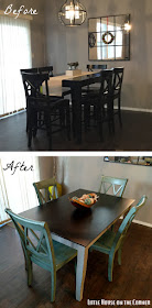
K. Now that we're all caught up, it's time to share the full reveal of the table transformation, including our new chairs!
While I had been fairly confident about the look of the table (two-tone; distressed legs), the chair selection was a different story. We weren't trying to find something to match the table, but rather just "go" with it. I'm all about the mix-and-match approach these days. But it was bit overwhelming to sift through all the options and make a decision on style, material and color.
At first we were thinking of some metal chairs like these
Anyway, we switched gears and started looking at some wooden chairs. I kind of liked this style, but then I stumbled upon these beauties and it was love at first sight:
I was immediately drawn to the blue-green hue (just had to get Luke on board with it) and the distressing. It seemed like it would be a fun complement to the newly-transformed table as opposed to a more neutral or dark chair. Plus, most of the reviews were pretty positive. Factor in the reasonable price (about $150 for a set of two) and Prime shipping, and it was worth the gamble.
Three days later, we had four chairs waiting on our porch. They each came packaged in two pieces like this, plus the two front legs:
Assembly wasn't too bad, just a little time-consuming with all the bolts. I will say that there was one chair which we'll probably try to send back for a replacement, due to some defects. A little frustrating, but I can't say I'm terribly surprised. It's structurally sound for now, so we went ahead and put it together (so I could take my pictures, obvs).
Aside from that, the chairs seem pretty solid overall and I'm really happy with how they look in person. The blue-green color is so pretty, and the dark distressed marks help them tie in with the dark table top.
Forgive the lighting, it's a little tricky to get good pictures in this space!
Just for good measure, here's a look at the before (counter-height; all black table & chairs) and after (regular-height; two-tone table with blue/green chairs).
My work here isn't quite done yet though... I'm thinking a table runner would be nice, and also debating whether or not to distress the table legs a bit heavier (right now it's just the edges). But at least the vision is all starting to come together, finally. Now if we could just get that kitchen finished... (There's a reason none of my pictures are taken from the other angle!)
NOTE: Little House on the Corner is a participant in the Amazon Services LLC Associates Program, an affiliate advertising program designed to provide a means for sites to earn advertising fees by advertising and linking to amazon.com.


Amazing, thank you for this great post! I love it.
ReplyDeleteWood Kitchen Table Sets
Furniture Stores In Denver Colorado
Now, back to the captivating design showcased in this blog. The use of contemporary colours to infuse life into country-inspired interiors is simply genius. It's a fantastic example of how design can evolve and adapt to our modern lifestyles while retaining the warmth and comfort of traditional aesthetics.
ReplyDeletehttps://promocodehq.com/zeus-network-promo-code
Cool
ReplyDeleteNice articles and your information valuable and good articles thanks for the sharing information balcony round table set
ReplyDeleteNice articles and your information valuable and good articles thanks for the sharing information Executive luxury cushion chair
ReplyDelete