

My absence on here the past couple of months doesn’t mean I’ve been totally unproductive. It’s been quite the busy summer, actually! I’ve been giving our bedroom a mini-makeover (more on that later), but I’m also quite pleased with my latest project.
I was first drawn to this idea when I saw it on Pinterest (here and here). The idea of vintage-y map wall art just seemed so cool – especially since we traveled to Europe earlier this year, which makes me feel more worldly and cultured. Like, now it’s legit to have a world map on my wall or something.
I didn’t really know where to find such a map, so I started with good ol' Amazon, where I ended up finding several options and sizes. There were quite a few 24x36” sizes, but since I had a large wall in mind for this project, I chose the giant 55x39” size. The map is actually more of a poster and obviously not true vintage, but it looks vintage and the colors work perfectly with the rest of the decor in our house. Including shipping & handling, the poster was about $18.
You can imagine my excitement when the poster tube showed up on our front porch a few days later in great condition (despite some reviews I’d read to the contrary). It was definitely gigantic!


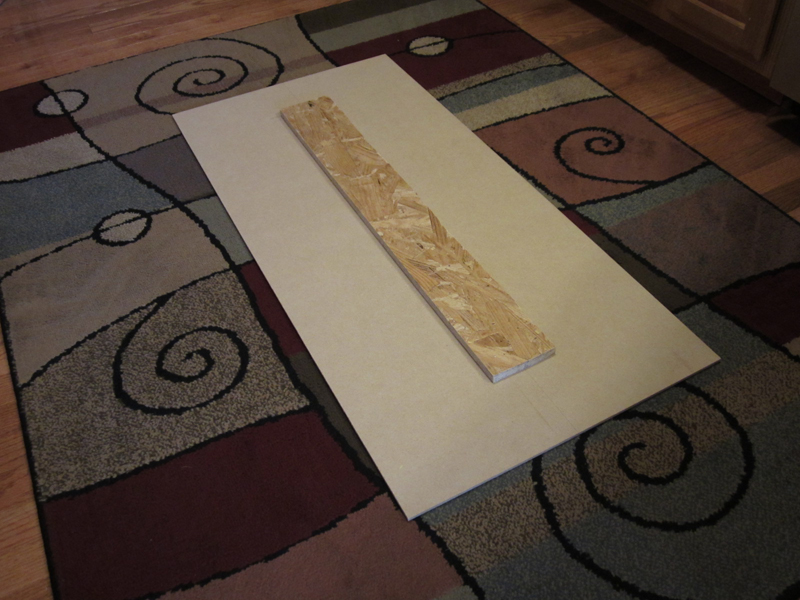
Just like I had seen on the other blogs, I wanted to make this project more difficult by cutting the map into three sections and mounting each separately on the wall (triptych-style). I struggled for awhile deciding what type of surface the poster should be mounted on. I wanted something fairly lightweight and inexpensive, and I couldn’t find any canvases or Styrofoam pieces that were taller than 36”. Then, during a trip to Home Depot, I stumbled upon ¼” MDF panels that seemed like they would work. Each 2’ x 4’ panel was about $6, so I grabbed three of them.
Because the panels were a little flimsy being that thin, we used some 1" thick plywood scraps to add a vertical support to the back of each one. In addition to making it more sturdy, I liked the idea of the panels being offset from the wall a bit for a more 3-D effect. I also decided that I wanted each poster section to have a narrow border (1/4”), so we kept that in mind when cutting down the MDF panels with the table saw.

Poster cut into sections with X-acto knife (18 3/8" x 39")

Then, I centered each poster section on a panel and taped off around the edges so that I could cover everything else with spray adhesive.

After spraying (outside, of course), I carefully placed the poster back on the panel and removed the tape. This part was super stressful, since the poster sections were still pretty big and I was worried it would get stuck in the wrong place on the MDF. Plus, it was starting to get dark outside, and a little breezy. But I was too impatient to wait for my husband to get home to have an extra set of hands (read: I wanted to prove that I could finish it myself without help).
Anyway...although I’m sure it’s not perfectly precise, it ended up looking pretty good (and worth the sore lower back).

Well, I still felt like the project wasn't quite finished, so I decided I'd try to spray it all with a clear sealer (Krylon 51313 Satin Finish Crystal Clear Interior and Exterior Top Coat - 11 oz. Aerosol
I temporarily propped up the map sections on the ledge in our stairwell, and they've been there for the past month, so I'm not sure when I'm actually going to get around to hanging them on this wall. But this is more or less where their new home will be, so you get the idea.

(bad lighting! bad!)


Linking up to....
Weekend Bloggy Reading at Serenity Now
Frugalicious Friday at Fabulous for Less
Frugal Friday at the Shabby Nest
Simply Creations Link Party
Show and Tell Friday at My Romantic Home
NOTE: Little House on the Corner is a participant in the Amazon Services LLC Associates Program, an affiliate advertising program designed to provide a means for sites to earn advertising fees by advertising and linking to amazon.com.
10 comments:
I LOVE this project! Super professional looking - it turned out awesome.
That turned out so cool! Love it.
This project provided a great focal point for your room. Great job!
Distressed Donna Down Home
These turned out really nice. And the colors are perfect for that wall.
Great idea! I scored some tall frames at a thrift store last week and wanted to do a three piece project with them and I didn't even think about using a map! Thanks for sharing!
I love this! I've been wanting to put a world map in my office and I think this is the perfect idea!!
Very fun project...love it! Thanks for leaving a sweet comment on my blog. Have a great week!
This is a really cool project Amanda! Thank you so much for visiting today, your latest reader
xoxo, Tanya
Super cool! You did a great job. I have been looking to get a big map for some art work too, so it was fun to see your take on it.
I found the easiest way to apply a big poster is to roll the poster with the design inside. Line up the starting edge where you want it and then unroll. Controlled and works like a dream!
Post a Comment